A photo a day of Rancho Palos Verdes, Rolling Hills & Palos Verdes Estates, located on the hills of PV peninsula at the southwestern tip of Los Angeles county
Saturday, June 5, 2010
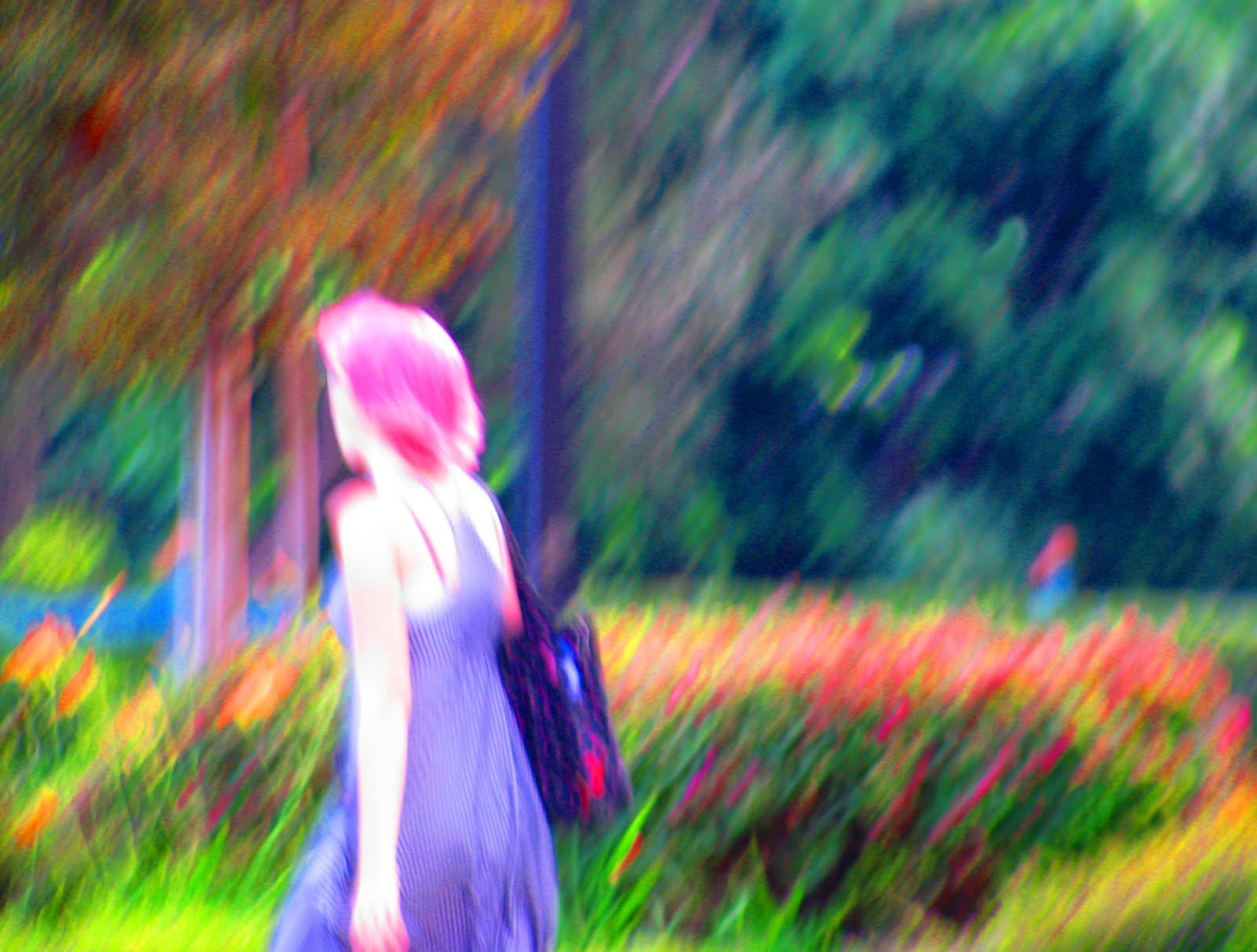
Pretty in Pink (2)
Walking to Peninsula Center, October 2008
Bad photography + upped staturation + "real" hair color = pleasing results.
13 comments:
That's a wonderful picture. I wonder how you did it.
a Monet! Love it!
Oh Tash I love it ! It looks like a watercolor painting.
Definitely an impressionist painting. No, an impressionist chalk pastel. Yep, definitely a pastel.
See what happens with a 'bad' photo! Sometimes they're some of our best, like here!
Wow, that turned out great!
It's fun and creative!
Yes, you've turned it into a lovely paintograph.
It is like a 'famous' painting. MB
This is so cool. I love how you processed this!
There you go. Thats a save
You are ready for an exhibit at the New Art league!!1
The unexpected happen even in errors! Very nice.
Post a Comment